Dragon Portfolio 101
Chris Cole of Artemis Capital released a paper titled, The Allegory of the Hawk And Serpent. The title may sound a little complex and philosophical, but you need to trust us on this one. From an investor's point of view, this paper is quite amazing and worth studying. Here's why.
The Dragon portfolio is an all-weather type of portfolio. That is, you can set it up and let it run with very little self-management and this portfolio will outperform the markets regardless of the situation.
Stagflation…deflation…first turnings…fourth turnings…you name it…the Dragon Portfolio will outperform.
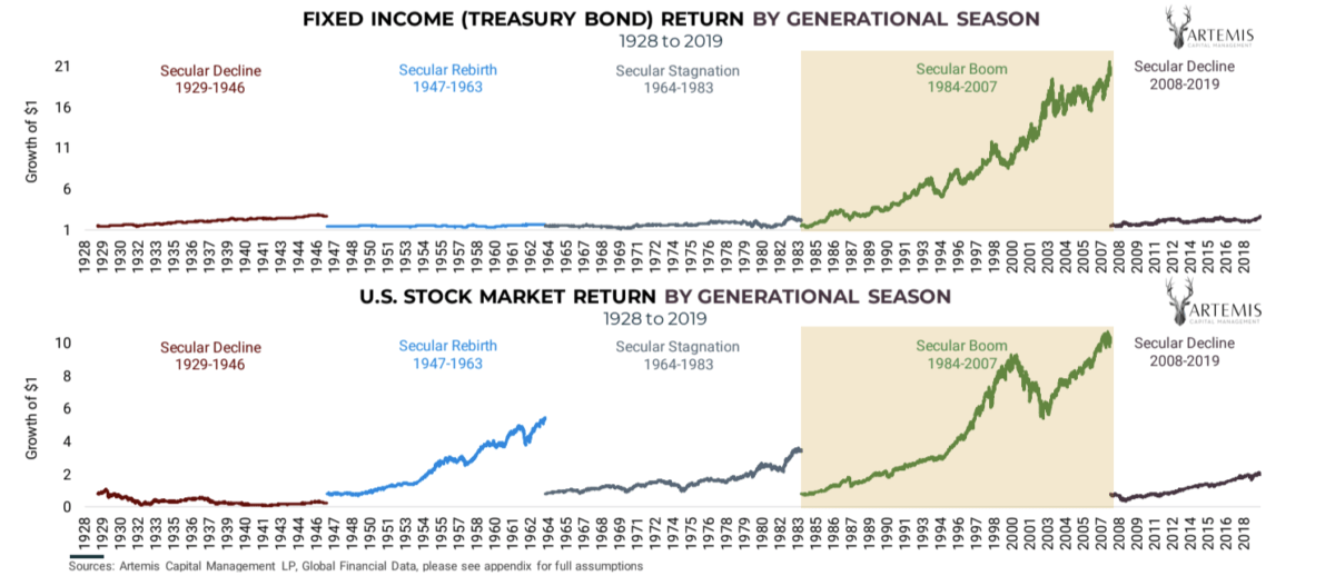
Take a close look at the image below. It displays U.S. treasuries and stocks from 1929 to 2020.
On the y-axis of the treasuries plot, we show the dollar from $1 up to $21. On the stock plot $0 to $10.
20 Year Cycles
Chris Cole breaks the markets down into two cycles of about 20 years each. One cycle he calls the serpent and the other he calls the Hawk.
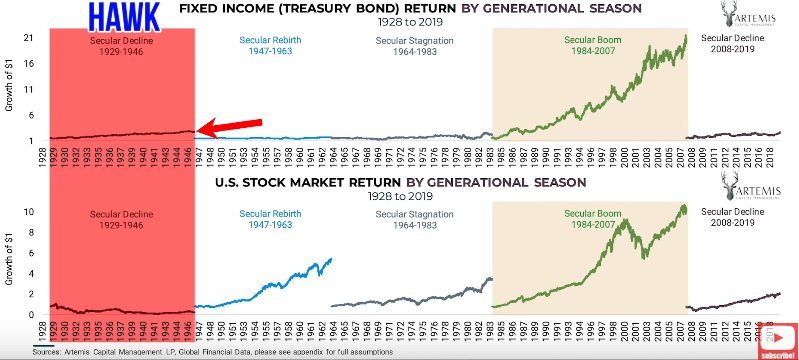
The Hawk
There was a hawk period from '29 to '46. This was a time when treasuries didn't do much at all. And during the same time frame, equities went down in value.
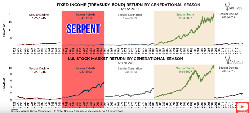
The Serpent
Then, from '47 to '63, we had a serpent period. Treasuries didn't do much, but stocks went up tremendously. Please keep in mind the charts are in nominal terms and not adjusted for inflation.
Other Hawk and Serpent Periods
Hawk 1964 – 1983
From '64 to '83, there was a hawk period again. Treasuries didn’t do much and stocks went up a little.
Serpent 1984 -3007
We got a massive serpent period from 1984 to 2007. Treasuries went up so high, that if you started with $1, you would end up with almost $22. That was just in treasuries.
Stocks in your portfolio would have shot up from zero to $11 or $12. Tremendous gains.
If you took the average Joe's risk parity portfolio – 60% stocks, 40% bonds – and let it ride starting 90 years ago, 91% of the gain would have come from 1984 to 2007.
Just that serpent period, 91% of the gain.
Think about what that means. Seventy years sitting in a portfolio only to see a 9% gain.
Hawk of 2008
Then in 2008, we went into the next hawk period.
Treasuries haven't done much. Stocks have gone up substantially, but remember: We are only 10 or 12 years into a 20-year cycle. We have another decade to go.
To dive into greater detail, here is an extract of Chris Cole's paper, Allegory of the Hawk and the Serpent:
The serpent represents a period of secular growth. Secular is long-term, fueled by the virtuous cycle of value creation and rising asset prices. The growth cycle begins naturally through some combination of favorable demographics, technology, globalization, and economic prosperity.
As the secular boom matures, it's corrupted by greed as fiat devaluation and debt expansion replace fundamentals as critical drivers of asset price gains, not unlike a serpent devouring, its tail into oblivion.
Greed fiat devaluation and expansion of debt replace fundamentals.
Wow!
How much of this reminds you of exactly what's happening today?
The hawk signifies the forces of secular change that will challenge and ultimately destroy the corrupted growth cycle of the serpent. The left-wing of the hawk is a deflationary path, whereby an aging population leads to low inflation, faltering growth, financial crash, and then debt default. The right-wing of the hawk represents inflation, fiat default, and helicopter money. The pattern is as old as money itself.
Now, with a better understanding of the two cycles, the hawk and the serpent, I will take a deep dive into what happened.
What happened in 1984?
How did we have such massive growth in the timeframe between 1984 and 2007?
It starts with demographics. We had a huge glut of the population. The baby boomers went into some of their peak spending years in the early 1980s. And this was combined with a dramatic cycle of falling interest rates the entire time, going from almost 20% down to 0%.
This created an environment of continually rising asset prices.
Next, we had globalization, which kept consumer prices low and an explosion of government, corporate, and consumer debt.
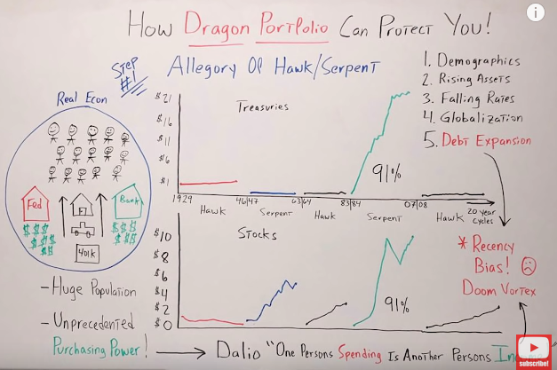
On the left side of the graphic, you can see we had the real economy and all the people coming into their peak spending time. They were making money so they wanted to buy houses, cars, and go on vacation. They wanted to spend money.
So the fed said: “We have your back. We will lower interest rates and we'll print up funny money. There will be a Fed put so don't you worry about it.” The banking system also came in and said: “Yes, we'll do the same thing. We'll get aggressive. We'll shower you with as much debt as you're willing to take on.”
As you could imagine, home prices went up. The same happened to vehicles, and the 401k went to infinity and beyond.
The bottom line is we had a huge population with unprecedented purchasing power. Remember what Ray Dalio has taught us:
One person's spending is another other person's income.
We had huge increases in spending and incomes, which led to a booming economy and booming asset prices. Unfortunately, as you know, there is no free lunch. It also created an even bigger doom vortex.
So what time is it now?
I think you know. It's a stiff drink time.
Comments are closed.