The Investing Portfolio That Survives Economic Collapse
Before Chris Cole’s Dragon Portfolio, investing in time’s of US dollar strength and weakness seemed impossible to achieve simultaneously.
Especially if you can't predict inflation or deflation.
Now you can figure out how to invest during inflation, deflation, and a recession. What’s even better, this strategy will do well in an economic collapse!

In this article, I explain in a detailed manner the hawk portion of the Dragon portfolio.
Chris Cole's Dragon Portfolio
First, let's go over a recap of Chris Cole's dragon portfolio we’ve discussed before. If you don’t know what the dragon portfolio is, you can click here to learn more.
Our economy operates in cycles. Chris Cole calls these cycles hawk or serpent cycles, as shown in the image.
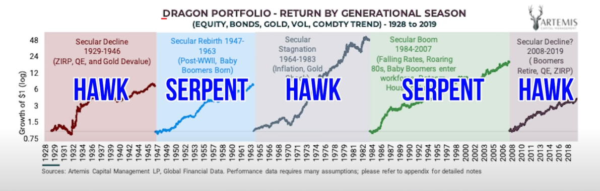
serpent cycle
A serpent cycle starts off very strong due to:
- A free-market economy
- Technology and
- Demographics
But then at the end of the cycle, it becomes very corrupt with crony capitalism, a massive expansion of debt, and of course, money printing.
hawk cycle
Then the hawk cycle comes in and wipes the slate clean. It gets rid of all the malinvestment and the misallocation of resources.
Starting off in 1928, if you would have had $1 in Chris Cole's dragon portfolio, by the end of this hawk cycle in 1946, you'd have $6.
You can see during every cycle, regardless of whether it's a hawk cycle or a serpent cycle, the dragon portfolio performs extremely well. Especially from 1965 to 1983 when we had an inflationary hawk cycle.
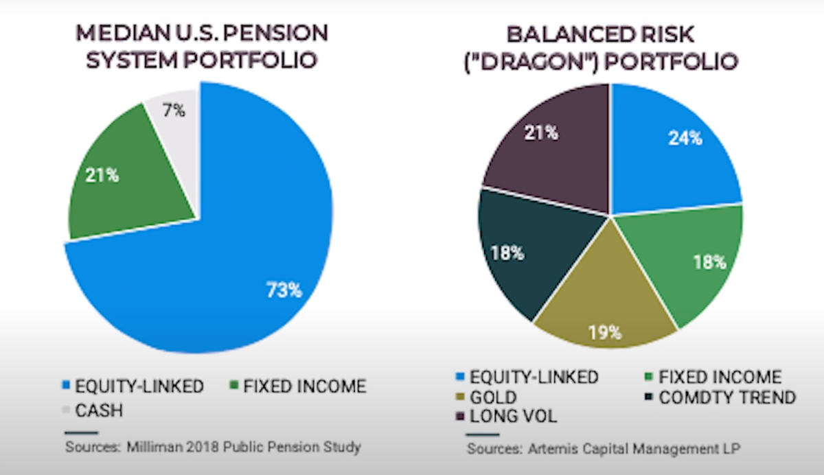 And looking at these pie charts, you can see how the dragon portfolio is extremely unique.
On the left-hand side, a normal portfolio has:
- 73% equities
- 21% bonds
- 7% cash.
But then we go over to Chris Cole's portfolio:
- 24% equities
- 18% bonds
- 19% gold
- 18% commodities trend following.
- And…This is where it gets interesting: 21% long volatility.
The Hawk Cycle – The Deleveraging Phase
Let's take a deeper look at the hawk cycle. This is the de-leveraging phase where we're most likely in right now, and we'll be in for the next decade.
Chris Cole describes this as the left-wing of the hawk and the right-wing.
 The left-wing is a deflationary de-leveraging, and the right-wing is an inflationary de-leveraging. Chris Cole has some charts in his report that go over this beautifully.
They're a little tough to read so I tried to simplify them here in my whiteboard.
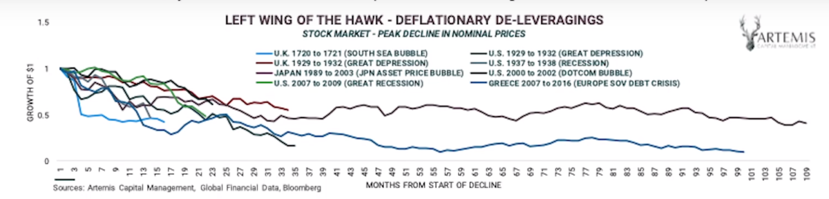
The Left Deflationary Deleveraging Wing
As examples, we'll use charts from the Great Depression from 1929 to 1932, and the recession that followed from 1937 to 1938.
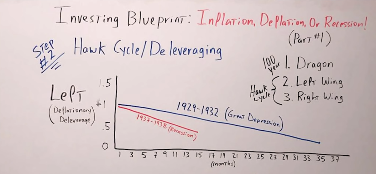
These charts represent the equities market, which means the stock market. It indicates the number of months the de-leveraging lasted, from one month all the way to 37 months, and on the left-hand side, it goes from zero up to 1.5. So this is what a dollar invested would have done during that time period.
We'll start from 1929 to 1932, and I've made this chart a lot simpler than Chris Cole's. In Chris Cole's Chart, you can see how it goes up, and down, but it’s a little tough to read, so I just made it a straight line in my whiteboard.
In 1929, if you would had $1 invested, 35 months later, that dollar would have been down to 50%.
Keep in mind, both these charts are in nominal terms, nominal numbers. They're not adjusted for inflation.
From 1937 to 1938, you would have lost almost the same amount, but in a much shorter timeframe, only about 15 months.
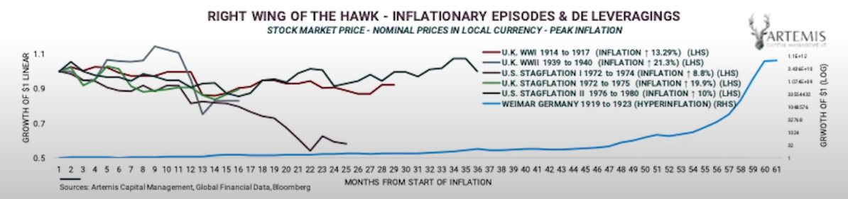
The Right Inflationary Deleveraging Wing
The right-wing of the hawk chart specifically was extremely interesting to me. Check this out:
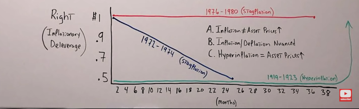 We start with the months below from two months to 38 months, and on the left, we start at the top with $1 invested.
It goes down to about 0.5 or 50 cents, so this is what your dollar would have done if invested in the stock market during this timeframe.
From 1972 to 1974, there was a period of stagflation. So inflation in the United States was running at 6, maybe 7%, and the stock market went down in nominal terms, not inflation-adjusted, nominal terms by almost 50%.
Even in the stagflation between 1976 and 1980, the stock market was pretty much flat.
So what this tells us is that inflation doesn't always equal asset price going up.
This takes me back to what I've said: Inflation and deflation are extremely nuanced. It's not binary.
And the only times throughout history where we've always seen asset prices go up is in times of hyperinflation.
The example Chris Cole uses in this chart is Weimar Germany from 1919 to 1923.
How The Dragon Portfolio Helps You Beat inflation, deflation, or a recession
So how can this help you build an investment blueprint for your own portfolio for an inflationary cycle, deflationary cycle, or a recession?
To be clear, the dragon portfolio is set up for the long term. This is a portfolio for a hundred years.
So regardless of what happens, what season, what cycle, you're going to do well over the long run.
But if you're looking at just the next five or ten years, look at the hawk cycle.
What's great about this portfolio is that you don't have to make a decision whether we're going to go into inflation or deflation, because parts of the portfolio that are meant for the de-leveraging work regardless of whether it's an inflationary de-leveraging or a deflationary de-leveraging.
In other words, it works regardless of whether or not we're going into a left-wing hawk cycle or a right-wing hawk cycle.
Before we continue, I want to point out something I think is extremely important: A chart of the S&P 500 in nominal terms.
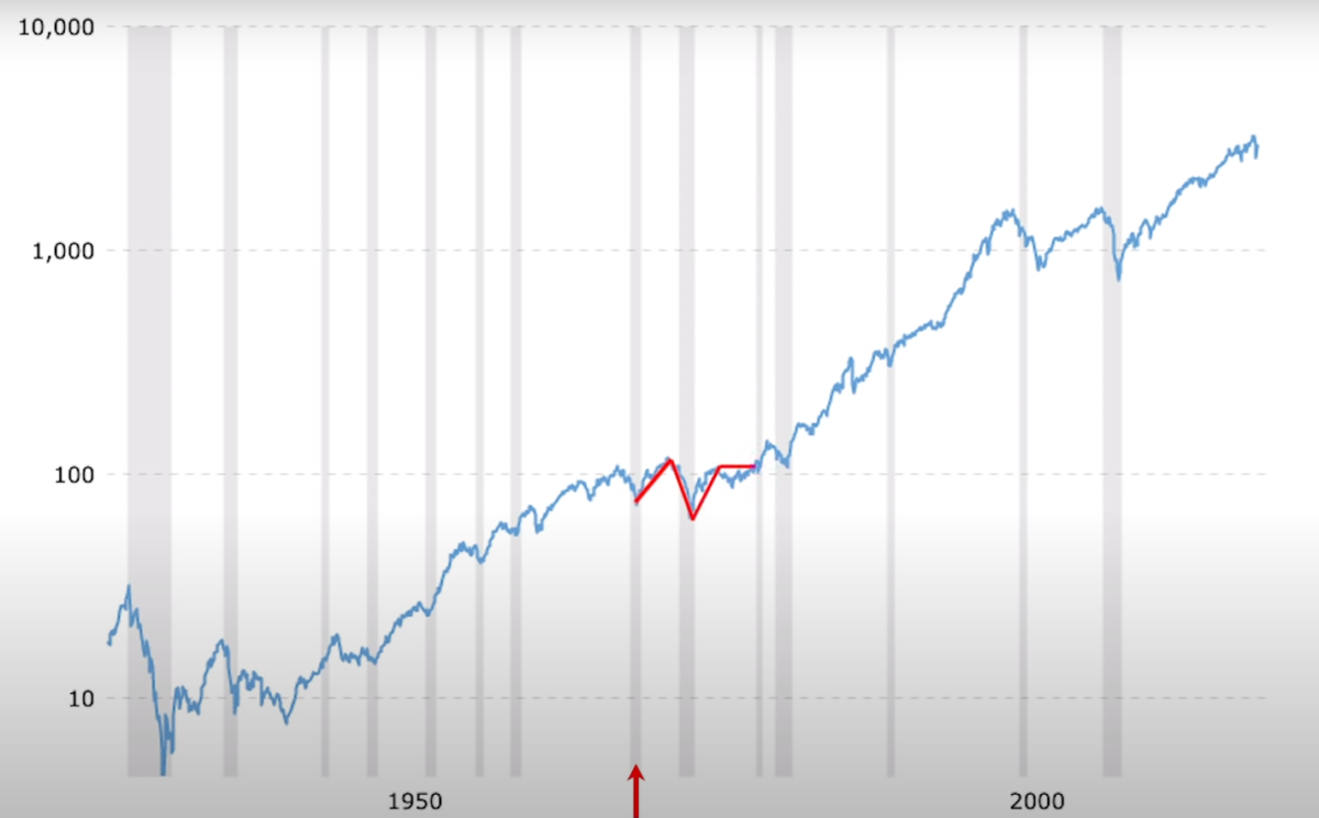
We can see it going all the way back to 1932, taking it to today, that it pretty much goes from left to right straight up without a hitch.
Even if you look at the 1970s specifically, it looks like it just went down a little bit and went right back up and kind of flat all the way to the end of the decade. But if you zoom in and look at what really happened and try to put yourself in the position of an investor psychologically, emotionally in the 1970s, we see a much different picture.
Here's the S&P from 1970 to 1980:
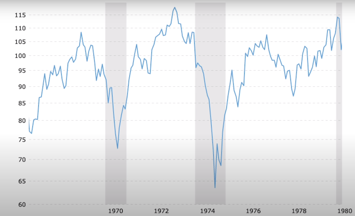
It looks anything but flat! Can you imagine being on this wild ride?
Starts off around 90, then plummets all the way down to say 73. I know it doesn't sound like a big move, but in percentage terms, it would have been huge.
Then from 1970, it skyrockets all the way up to 116, and then comes crashing down again to under 65, and then right back up to call it 105 in 1980.
It looks like a roller coaster when you zoom in, but when you zoom out and look at it over the span of 90 years, it just looks like a little blip.
So my point is, whenever you're looking at the charts, regardless of whether it's the S&P, whether it's commodities, precious metals, bonds, whatever it is, look at the full historic view. But then look at it decade by decade, and definitely in percentage terms, nominal terms and real terms adjusted for inflation. That's the only way you can get the entire picture.