The great reset agenda…build back better… stakeholder capitalism…the public-private partnership…
This is all related to the government's plan to make you poor.
[ctt template=”5″ link=”hYw86″ via=”no” nofollow=”yes”]The great reset agenda…build back better… stakeholder capitalism…the public-private partnership… This is all related to the government's plan to make you poor.[/ctt]

The Inflation Tax
Most people know about the inflation tax, but they really haven't thought through how this really impacts the average Joe, and average Jane.
We'll start with a chart going all the way back to the early 1900s to 2020 or around today's date.
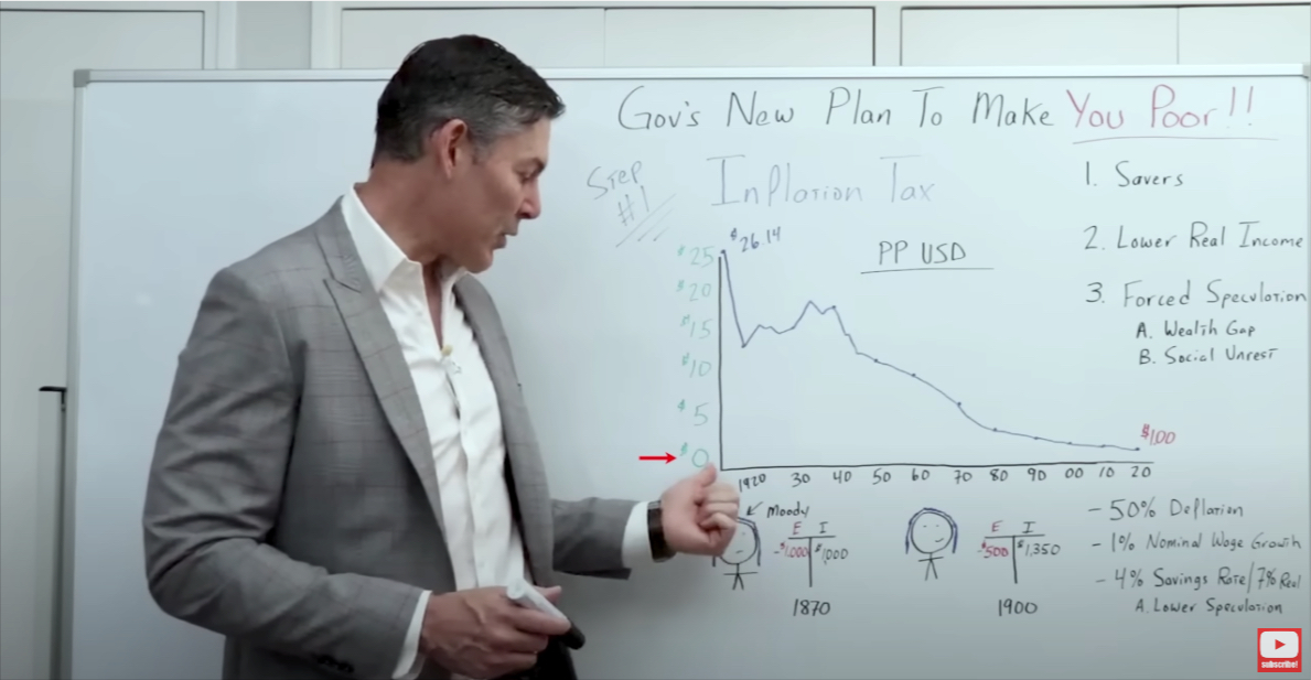
On the left, we go from $0 – $25. This is the purchasing power of the US dollar over time.
So $1, back in the early 1900s, purchased $26 worth of stuff today.
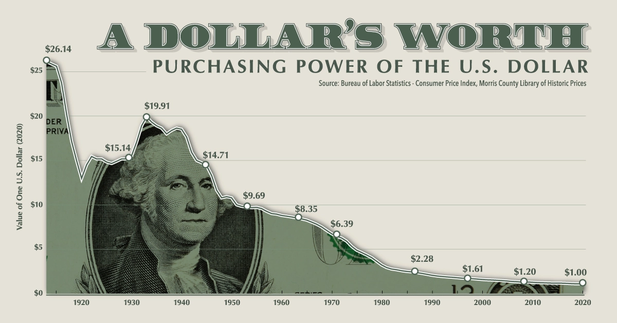
If you bought $26 worth of stuff at Target today, you could have bought that same amount for $1 in the early 1900s.
[ctt template=”3″ link=”W20vb” via=”no” nofollow=”yes”]If you bought $26 worth of stuff at Target today, you could have bought that same amount for $1 in the early 1900s.[/ctt]
And it goes down rapidly with World War One, and then it goes back up slightly with the Great Depression.
But then really pretty much straight down to where we are today, where the dollar has lost over 95% of its purchasing power.
There are obvious negative consequences for society, especially for the poor and middle class.
Negative consequence #1 – Savers Get Crushed
Anyone who is prudent enough to save money gets hurt because the value of that money decreases rapidly.
Negative consequence #2 – Lowers Real Income
Income, when you adjust for inflation, is lowered with price increases. Wages do not increase as fast as rising prices therefore, they are usually falling further and further behind.
Negative consequence #3 – Forces Speculation
If you're getting 0% interest rates in a checking account, or a savings account, then you have to do something with the money. You've got to put it into the stock market. You've got to buy cryptocurrency, you've got to buy real estate. It turns the average Joe and Jane into a speculator.
[ctt template=”3″ link=”LzlRM” via=”no” ]If you're getting 0% interest rates in a savings account, then you have to do something with the money. You've got to put it into the stock market. You've got to buy cryptocurrency, you've got to buy real estate. It turns the average Joe and Jane into a speculator.[/ctt]
If we had deflation, you'd put that money in the bank, and you'd earn a 4% return. If we had 2 or 3% deflation, that'd be a 7% real rate of return going to your back pocket almost risk-free.
Negative consequence #4 – Forced Speculation Increases Wealth Gap
Forced speculation also increases the wealth gap, which inevitably increases social unrest and can lead to the deterioration of society.
But to really get your head around how this makes you poor, we have to understand how a healthy decrease in prices as a result of additional productivity would make you rich.
How Healthy Deflation Builds Wealth
So insert everybody's favorite, Moody The Millennial, with their blue hair, because obviously, we don't know Moody's preferred pronoun, so we'll go with ‘their.'
Moody, with their blue hair, looking melancholy as always, has their p&l right here.
On the right, we've got their income. And on the left, we have their expenses. And let's say that Moodie lives in the year 1870. We'll also assume that they just work at the local McDonald's.
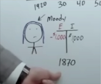
The 1870s version of McDonald's. And their expenses are pretty much equal to their income. So they are just getting by.
Alright, well, let's assume that we fast forward to the year 1900, and Moody is still working at McDonald's, but their wages have gone up slightly.
Let's assume nominal wages have increased by 1%. But keep in mind, we have deflation. So prices are going down, but nominal wages have increased by 1%. That would give them a monthly paycheck of about $1,350.
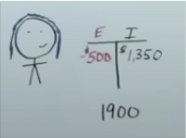
And you might say, “My gosh, George, that's absolutely terrible. Moody was sitting there flipping burgers for 30 years, and their paycheck only went up by $350.”
Right, but what happened to their expenses?
Between 1870 to 1900, we had about 45% deflation.
In other words, prices went down by almost 50%. So Moody's expenses would have gone from $1000, all the way down to $500. And now Moody would have an additional $850 a month to spend on other things.
And oh, by the way, that $850 a month would have more purchasing power than it did in 1870. Oh, but wait, there is more.
If Moody had taken that money and put it into a savings account, they most likely would have gotten about a 4% rate of interest, which means that their money would have compounded at a real rate of about 7%.
This lowers the need to go out and take risks in speculative assets.
When you look at how deflation can make you rich, it becomes very obvious as to how inflation can make you poor.
The Sound Money Myth
Now let's go over the “sacred cow” known as the sound money myth. Then we'll connect the dots, and I'll show you the government's new plan to make you poor.
What Is Sound Money? Sound money is a term that refers to a currency that holds its value over time. This monetary system has been around for centuries in various forms and is characterized by sound fiscal and monetary policy.
Sound money has a consistent store of value without fluctuating like other vulnerable forms of currency; plus, it also has a fixed supply, meaning it cannot be easily inflated or devalued.
Today’s sound money is backed by hard assets such as gold or silver — giving it an added security measure in the economy to prevent runaway inflation and chaotic cycles.
I know for a lot of you reading and watching right now – a lot of the Bitcoiners, the gold bugs, the Austrians – you'd say:
“Oh my gosh, if we just had sound money, it would solve all of our problems. It would be a panacea, we would never have the inflation that George was talking about earlier. The inflation that's so destructive to society.”
Maybe? But maybe not!
Let's look at a chart from 1987 to 2019.
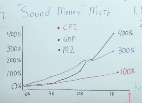
The red line indicates CPI. Or at least what the government will admit to as far as price increases in the real economy.
And from 1987 to 2019, we had about a 100% increase in consumer price inflation.
The blue line represents nominal GDP. It's very important that you understand the difference between nominal and real (real is adjusted for inflation). We're going to get to that in just a moment.
Real GDP went up around 300%.
The black line indicates M2 money supply. During this timeframe, M2 money supply went up by a staggering 400%.
Now all you sound money people are out there saying:
“See, George, look, the money supply goes up, and it creates consumer price inflation. So if we could just get the money supply to go back down, then it'd be a lot better for everyone.”

Okay, well, let's check out a chart from 1867-1899, a timeframe with the same number of years.
I also want to point out that the first chart (1987-2019) is under a complete fiat system, while the chart below is on a gold standard. It's probably the most stringent gold standard we have ever had in the United States.
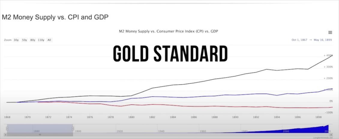
1867 to 1899 (Gold Standard)
Black line – You can see from 1867-1899 M2 money supply went up by 400%. Pretty much the exact same as what we've seen in the 1987-2019 chart.
Blue Line – Then we had nominal GDP go up by 100%.
Red Line – Consumer price inflation goes down -45%. In other words, deflation by 45%.
So with the exact same increase in M2 money supply, but with one timeframe (1987-2019) producing 100% inflation, and the other timeframe producing 45% deflation (1867-1899).
How is this possible if CPI and GDP hypothetically revolve around sound money or a fixed money supply?
Now, I know a lot of you right now are saying to yourselves, “Yeah, George, but if we would have had a 0% increase in M2, then -45% deflation would have been even better.”
You can see by looking at M2 Money supply vs CPI (1867-1899), and M2 Money Supply and CPI (1987-2019) this relationship is by no means fixed.
You can have dramatic increases in M2 money supply and still experience either deflation or inflation. They are not fixed variables. Sound money or a fixed money supply does not guarantee CPI increasing or decreasing. There are other forces at play.
[ctt template=”3″ link=”0ouvc” via=”no” ]You can have dramatic increases in M2 money supply and still experience either deflation or inflation. They are not fixed variables. Sound money does not guarantee CPI increasing or decreasing. There are other forces at play.[/ctt]
This is shattering one of the sacred cows for those who believe that fixed money can constrain CPI.
So if the level of inflation isn't strictly due to the increase in M2 money supply, what is it all about?
Well, I think, along with Milton Friedman, that it's more so about M2 money supply versus real GDP. Let me show what I'm talking about.
M2 Money Supply Vs Real GDP
Let's go back to that late 1800s timeframe (1867-1899). And remember, this is under a gold standard.
There was an increase in M2 money supply of 400% and 45% deflation.
But when you calculate real GDP, not just nominal GDP, you have an increase of 300%. Which means productivity increased substantially over that time period.
Real vs. Nominal GDP – There are two ways to calculate GDP: nominal GDP and real GDP.
Nominal GDP tracks the total value of goods and services produced in an economy in a given time period by calculating all their quantities and all their prices.
Real GDP tracks the total value of goods and services, calculating the quantities but using constant prices.
Real GDP is a more accurate gauge of the change in production levels from one period to another, but nominal GDP is a better gauge of consumer purchasing power.
1960 – 1991 (mixed fiat and gold standard)
All right, let's fast forward to the 1960s and 70s, and part of the 80s.
Again, this is roughly a 30-year timeframe where we had a mix of policies.
During the 1960s, we were still on a gold standard which was removed in 1971.
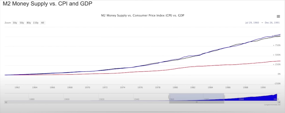
During this period, we had a 1,000% increase in M2 money supply.
Real GDP only increased by 137%.
With such a massive increase in M2 money supply, you would assume that inflation would be exponentially higher than in the 1867-1899 period (45% deflation).
It wasn't just higher, but dramatically higher. A 365% increase in real consumer prices throughout the real economy.
Well, now let's fast forward to this more recent timeframe that we discussed (1987-2019).
1987-2019 (Fiat Standard)
Remember, the 1987-2019 period is under a complete fiat system, where M2 money supply growth was the exact same as the late 1800s period we've been analyzing.
Recall that from 1987-2019 we had a 400% increase in M2, a 67% increase in real GDP, and a 200% increase in CPI.
You would expect consumer prices to increase, but not as high as they did during the 1960-1991 period when there was a 1000% increase in M2 and a 137% increase in GDP.
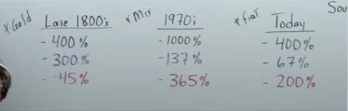
And you can see, right on the money, we've got a 200% increase compared to 365% and a decrease of 45%. Exactly what you would expect.
So my point is not to say that sound money isn't desirable, or that an increase in the money supply is completely irrelevant. Absolutely not. My point is to say that there's more than one variable involved.
Sound money might not be the most important variable to consider when trying to figure out what creates the negative consequences of consumer price inflation that make you poor.
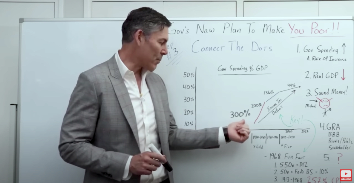
Connecting the Dots
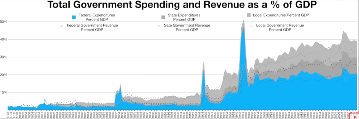
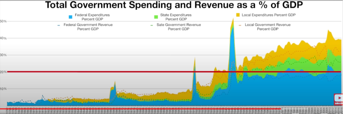
We look at a chart going all the way back to 1800. In fact, the original chart goes back further than that. And we go all the way to 2020 or 2022. Stopping just short of the cerveza sickness. Around March 2020 or the middle of 2020.
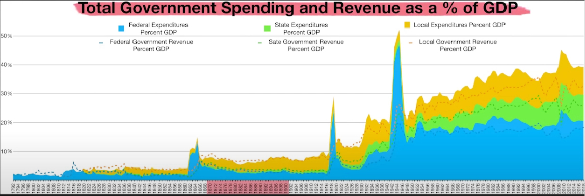
We'll start with 1870 to 1900. We can see that right around this time, government spending, as a percentage of nominal GDP, was under 10%.
Moving on to the next time sequence, 1930 to 1960.
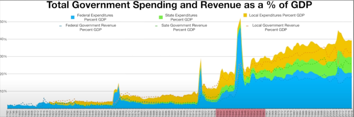
If you are a student of history, then you may know that government spending increased dramatically during this time.
We go from government spending around 15% of GDP, all the way up to 30%. A dramatic increase.
Moving on to the next timeframe, from 1960 to 1990, it went up by another 10%. From 30%, up to roughly 40%.
Then lastly, from 1990 to 2020.
Government spending as a percentage of GDP goes from about 40%, to call it maybe 45%.
And I just had to use some back-of-the-napkin math to come to that 45 number. So it's not exactly precise, but it gives you the idea.
It helps you understand the concept that I'm trying to illustrate. Here's where it gets interesting.
This black number above the timeframe represents real GDP.
So when government spending was less than 10%, from 1870 to 1900, real GDP was 300%.
When government spending went from 15% to 30%, from 1930 to 1960, real GDP went down to 200%.
When government spending went from 30% to 40%, from 1960 to 1990, real GDP went down 136%.
And then lastly, as government spending as a percentage of GDP continued to increase, the real GDP went down again, from 136% to 94%.
And let's keep in mind that real GDP, although not a perfect number, is a proxy for how well the economy is functioning.
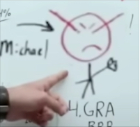
I know right about now your friend and family member Fred, and this guy right here are really pissed off at me.
We'll call him Sound Money Michael.
And Sound Money Michael has the laser beams coming out of his eyes, and he's shaking his fist, saying,
“George, damn, you, damn you. How dare you criticize the principles of sound money? How dare you? And how dare you imply that sound money might not be a panacea. And there could be other variables, including money supply, that impact inflation?”
Well, the first thing that I would point out to Sound Money Michael, is that during this rapid increase in government spending, we were on a gold standard.
I understand it was a quasi-gold standard. But let's look at the most recent increase that was rather tame, historically speaking. And that's when we were on a complete Fiat standard.
So I don't think we can say with 100% certainty, that if we went on to a gold standard, or a Bitcoin standard, that government spending, as a percentage of GDP would be extremely low.
I know this is going to be a big sticking point for most people watching this video or reading this post. And trust me, I totally get it. From the moment I started studying macroeconomics in 2012, I was under the belief that if we just had sound money, it would definitely limit the size of government, which at the end of the day, is everybody's objective.
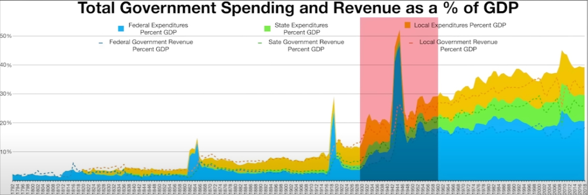
So to dive into the details, let's take a closer look at the chart that we've been using.
The blue area represents federal spending as a percentage of GDP. And this blue dotted line shows us what government revenues were. So how much they are collecting in taxes.
Then the green area and the yellow area represent state and local government.
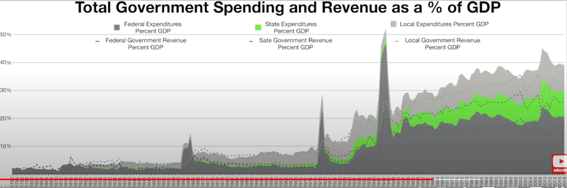
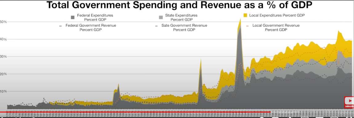
Same thing with the dotted lines that you see within those two colored areas.
And then the difference between the dotted line, and then the top of the shaded area would be deficit spending.
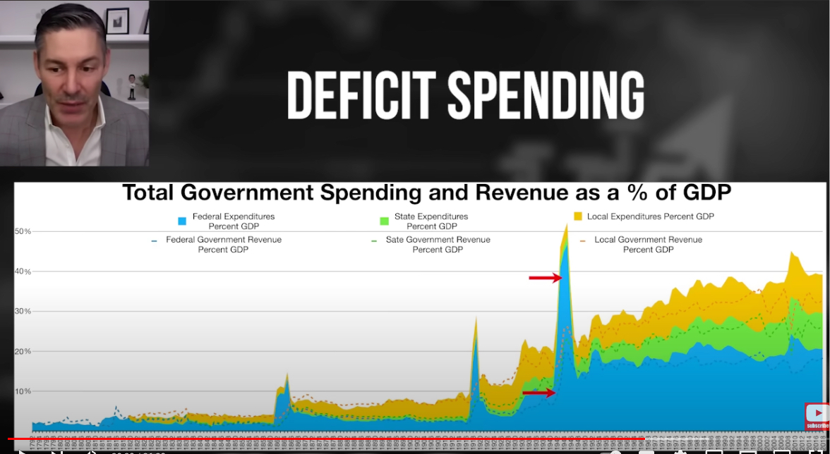
So again, dotted line, what they're collecting in taxes, the difference would be deficit spending.
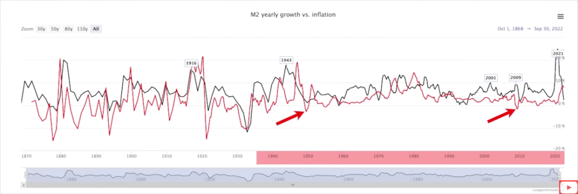
Before we move any further, I want to point out that from the late 1930s, or maybe 1940, to today's date, we've had very few periods of deflation.
And the few periods that we've had have been very minor and very short-lived.
If we go back prior to the late 1930s, we saw that it looks just like a heartbeat.
We'd have inflation, deflation, inflation, deflation, and it would almost net out.
There was a significant change, right around 1940. What was it?
Well, my theory is that government spending got to a level where it was pushing out the private sector enough to create this environment that is conducive to consumer price inflation.
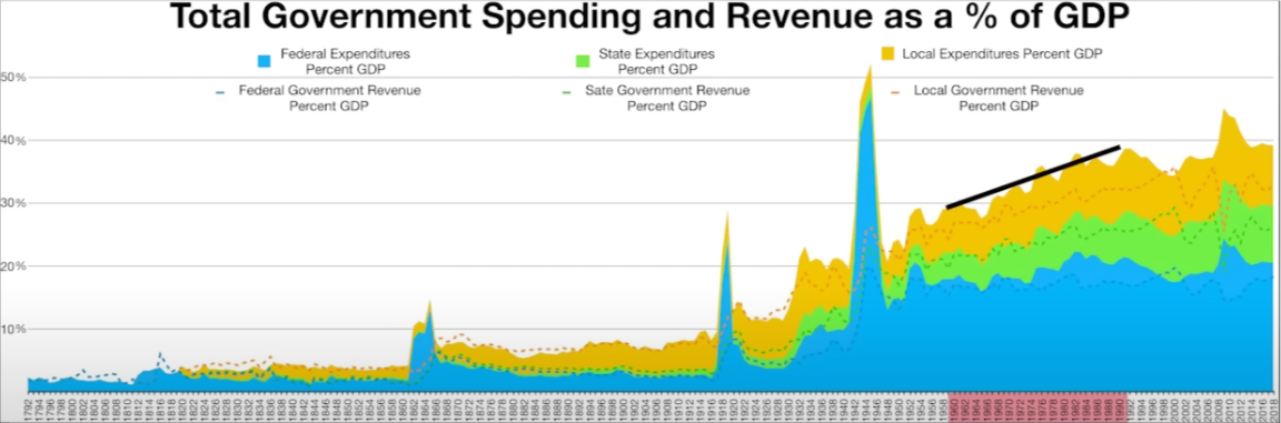
I think that line in the sand if we look at the chart below, is probably around 20% of government spending as a percentage of GDP.
So you can see that we got to that high watermark just before World War Two. And from that point, it was pretty much up in a straight line.
Would sound money prevent the government from getting to this 20% mark?
Well, what we can see by looking at the above chart, is the majority of government spending is not coming from deficit spending. It's actually through taxation.
So even if sound money was able to eliminate government deficit spending, which I don't think it would, because I still think they would sell bonds. But let's just assume for a moment, this was the case, I don't know if that would solve the problem.
And let's look at one other key component. When we highlight from, let's say, 1984 to today's date, we see that state and local spending in and of itself would almost get it to this 20% mark.
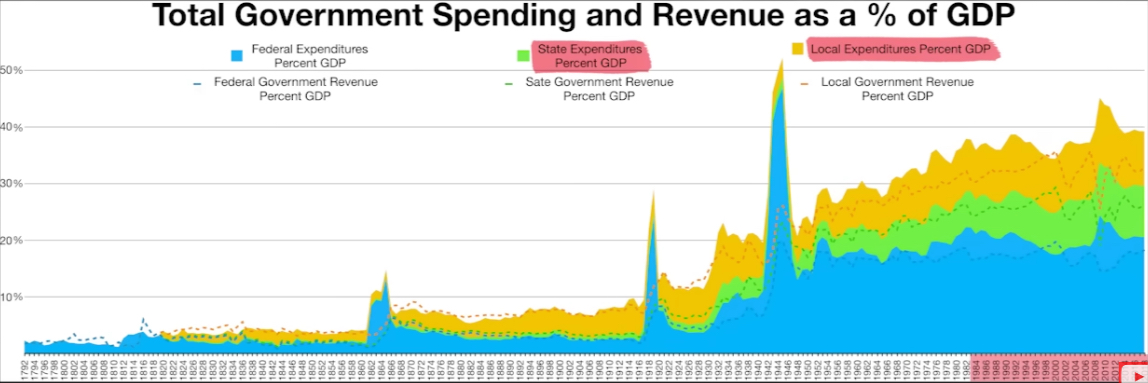
And let's keep in mind that state and local governments don't have access to the Federal Reserve. So their spending is strictly from taxation and issuing bonds that they're selling to people that are buying them with money that already exists.
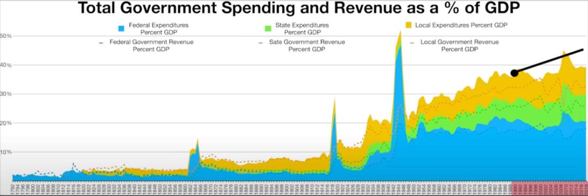
Tax Revenue Is Key
So the main takeaway is if we really want to get serious about creating an environment that allows free market capitalism to flourish, and actually creates this beneficial price deflation that we've been talking about, we've got to focus on tax revenue. This is the key.
[ctt template=”3″ link=”ZjO49″ via=”no” ]If we want to get serious about creating an environment that allows free market capitalism to flourish, and actually creates beneficial price deflation, we've got to focus on tax revenue. This is the key.[/ctt]
Unfortunately, I don't think there's a strong argument for sound money in and of itself, bringing that tax level down under 20%, of GDP.
I also want to make it very clear that when I started doing this research, I started from a standpoint of wanting sound money to be a panacea. That's what I wanted. The more and more research I did, the more I found that that's probably not the case.
So my objective is not to trigger you. It's just to get you to look at some of these things that have been said over and over and over and over again, so many times that we just assume they have to be true.
And to scrutinize them, look under the hood, and say, “wait a minute, maybe there are ways to think about this kind of outside of the box that would help us shrink the size of government that are even better.”
The Government's Plan To Make You Poor
Now that we understand that an increase in government spending (as a percentage of GDP) leads to lower real GDP growth, and creates an environment where negative inflation can flourish, we now need to look at the government's plan to make you poor through this lens.
[ctt template=”3″ link=”389×0″ via=”no” ]Understand that an increase in government spending (as a percentage of GDP) leads to lower real GDP growth, and creates an environment where negative inflation can flourish, we now need to look at the government's plan to make you poor through this lens.[/ctt]
And you may say to yourself, “Okay, George, I'm kind of following you. But what are you talking about specifically?”
All right, The Great Reset Agenda – Build Back Better – The Private Public Partnership – Stakeholder Capitalism!
All of these central planners, authoritarians, global elites, and politicians – The rhetoric they constantly talk about does what?
It increases government spending as a percentage of GDP. And we can see this playing out right in front of our eyes.
[ctt template=”3″ link=”Y32S_” via=”no” ]All of these central planners, authoritarians, global elites, and politicians – The rhetoric they constantly talk about does what? It increases government spending as a percentage of GDP. And we can see this playing out right in front of our eyes.[/ctt]
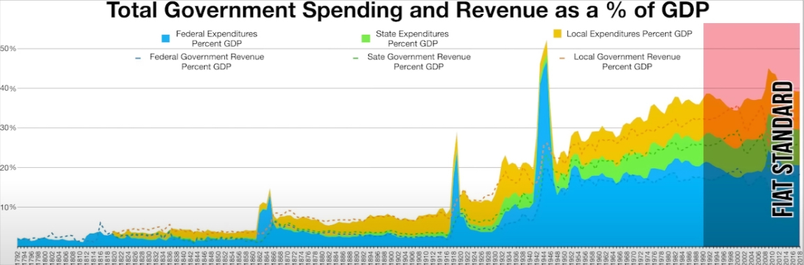
The chart below is of real GDP. Over 2022 it's completely flat. If the bond market is any indication, then you know that real GDP is likely going to decline throughout 2023.
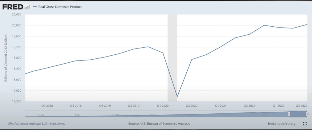
If these programs or agendas continue to increase government spending as a percentage of GDP, which lowers the real GDP growth of the economy, then you should expect to see more and more inflation throughout this decade.
[ctt template=”3″ link=”6b42S” via=”no” ]If these programs or agendas continue to increase government spending as a percentage of GDP, which lowers the real GDP growth of the economy, then you should expect to see more and more inflation throughout this decade.[/ctt]
That, unfortunately, will make the average Joe and Jane and maybe a lot of people that are watching this video a lot poorer in terms of their standard of living.